Harnessing the exponential growth in AI capabilities to solve a widespread, fundamental usability problem potentially affecting billions of people worldwide.
Presbyopia (age-related farsightedness) and digital eye strain are widespread problems affecting an increasing percentage of the population. I feel the current methods employed by Apple and other companies to handle text size and readability on their devices are inadequate at best.
This is a personal project that seeks to leverage emerging AI capabilities toward improving the general usability of mobile devices, particularly with respect to consistent text readability. According to my research, the AI and I/O capabilities of current (or near-future) smartphones is sufficient to allow for real-time, automated adjustment of text size based on either user-calibrated data or through visual/facial cues given by the user (or both). What follows is a theoretical expansion of Apple’s iOS mobile system that would allow the user to enjoy real-time, customized, consistent readability on their devices no matter what screen or app they are using.
I scoured the web: Apple forums, Reddit threads, blog posts and various articles for information about this problem. I also interviewed family and friends and random people I met over several weeks and came to the conclusion that although the current system works for a lot of (mostly younger) people, many others would welcome a different, more effective way to manage the text sizes on their phones. Here is a brief summary of my findings:
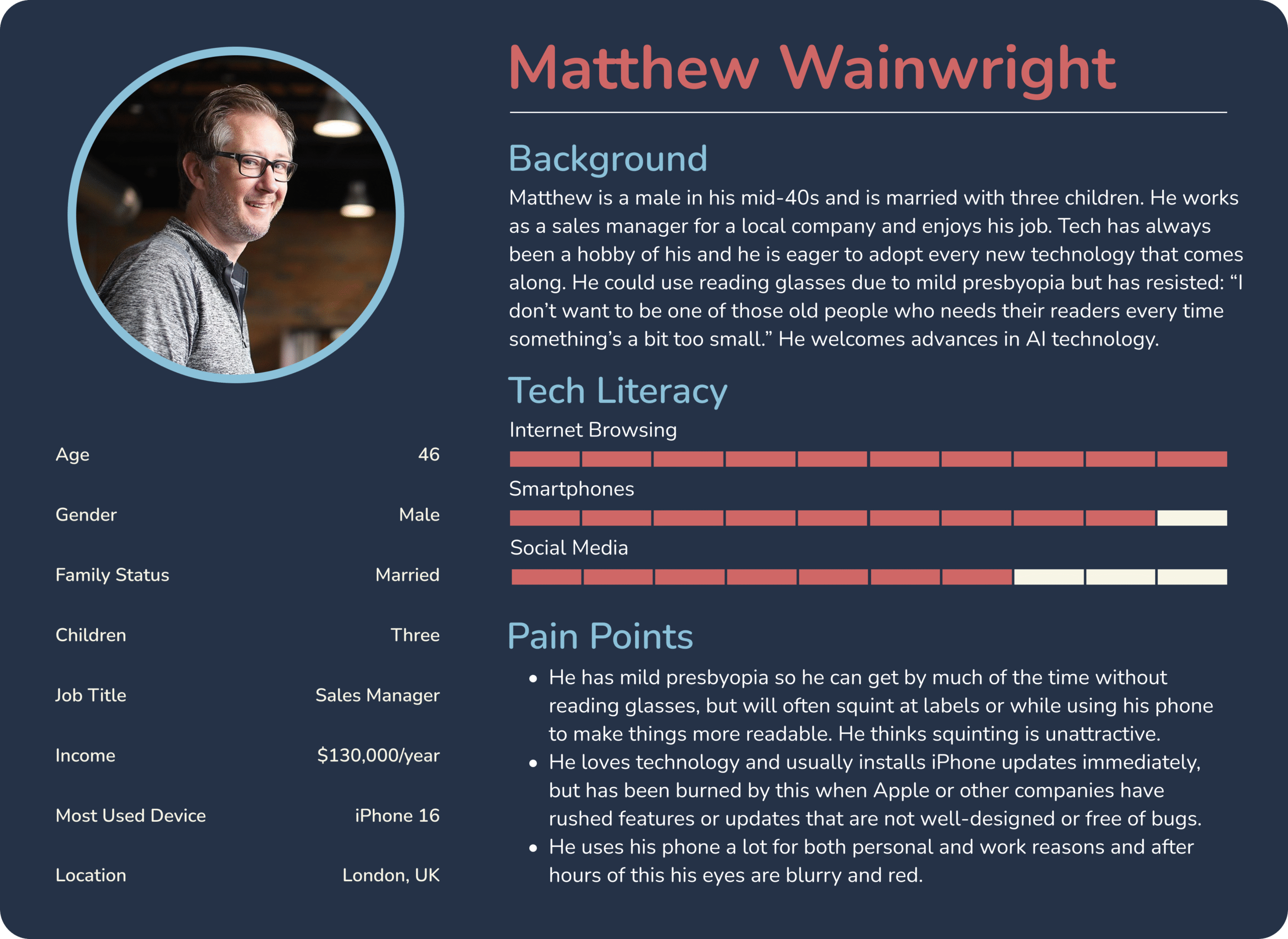
- Most of the people who struggle are over 40 and suffer from presbyopia (age-related farsightedness).
- Seniors struggle the most as they not only have more vision problems but are also not always tech-savvy.
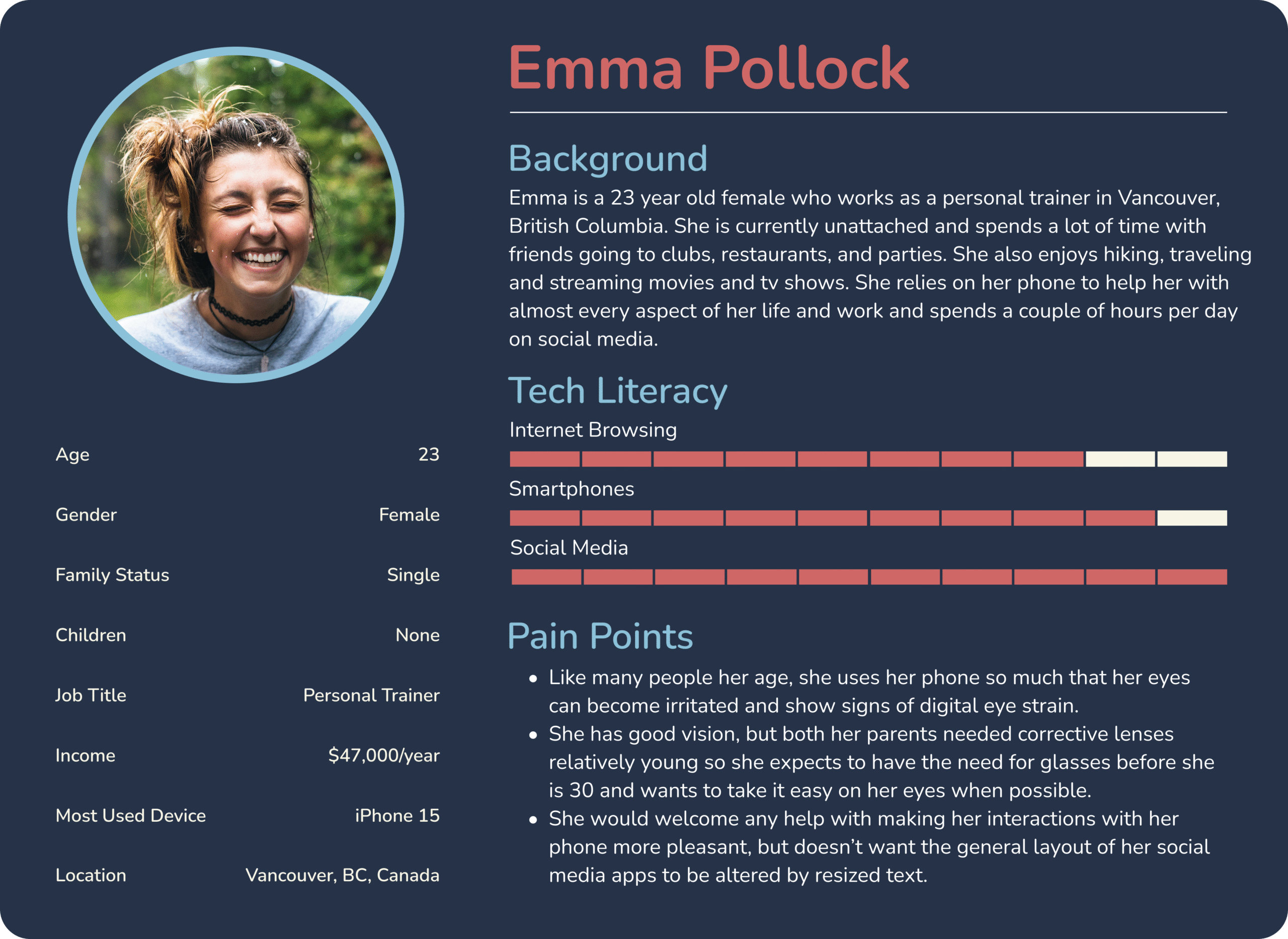
- Most younger people were indifferent because they were both tech-savvy and still had good eyesight.
- When asked about an AI system, most said it could be worth it if Apple assured them there would be nothing recorded/uploaded to their servers.
These findings compelled me to focus my attention on the older population as they are most affected. My solution would be a separate option within iOS that can be disabled if the user prefers the current system.
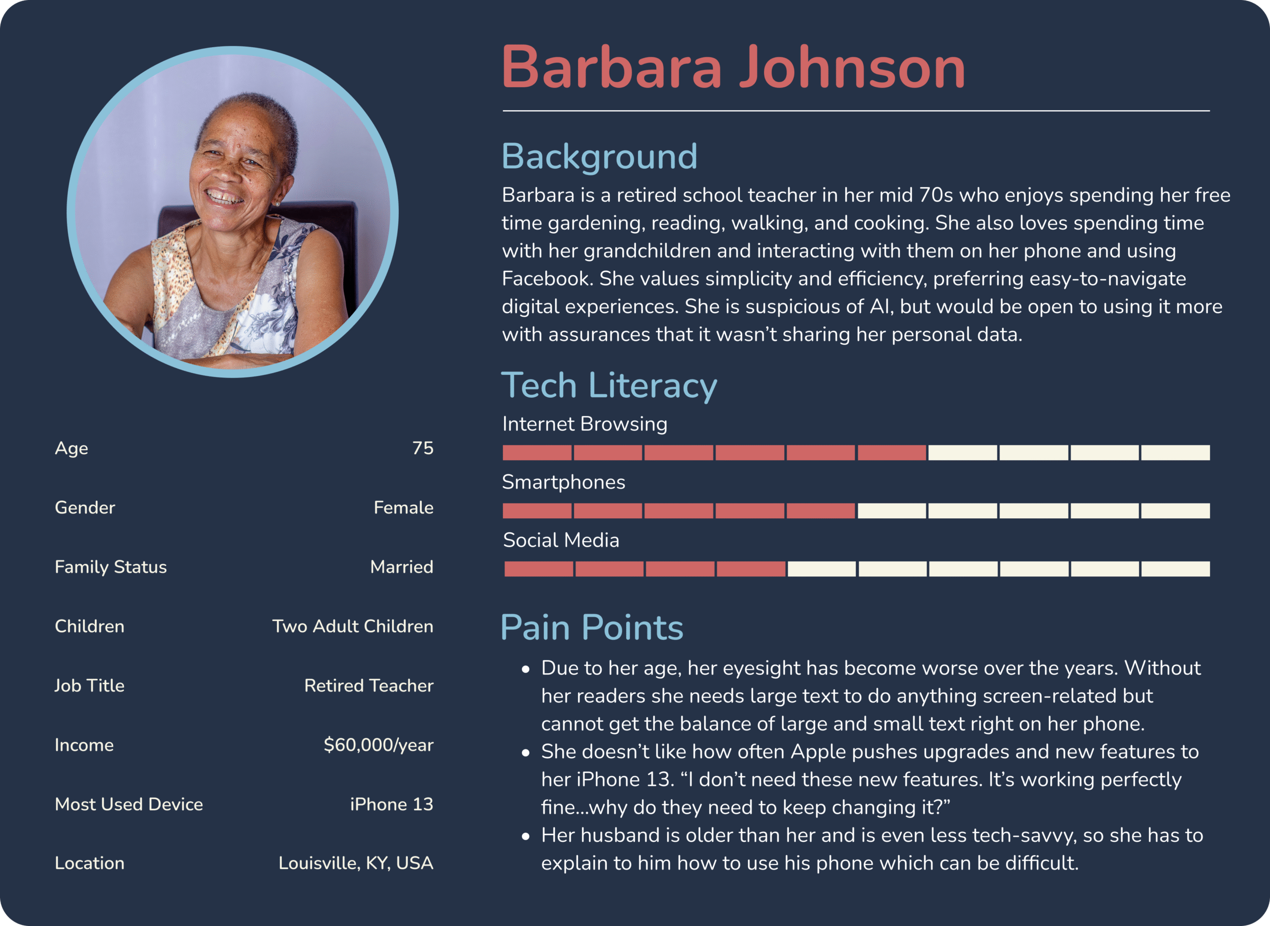
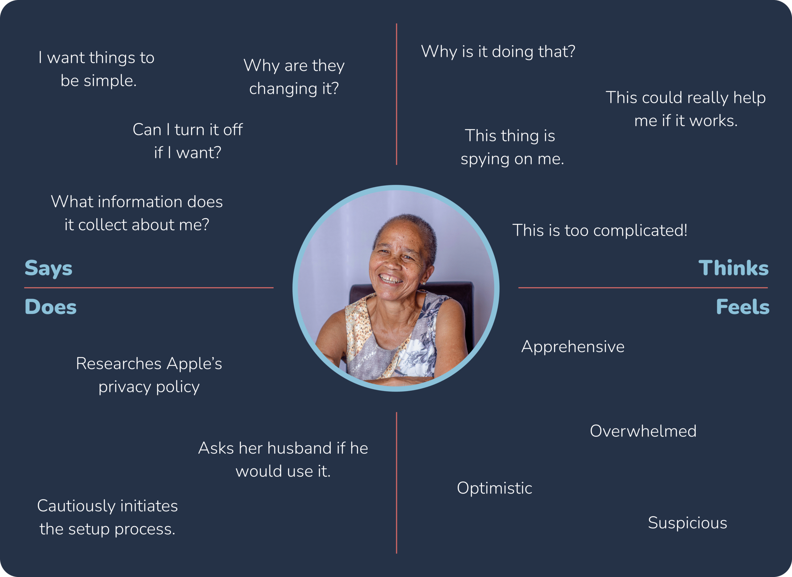
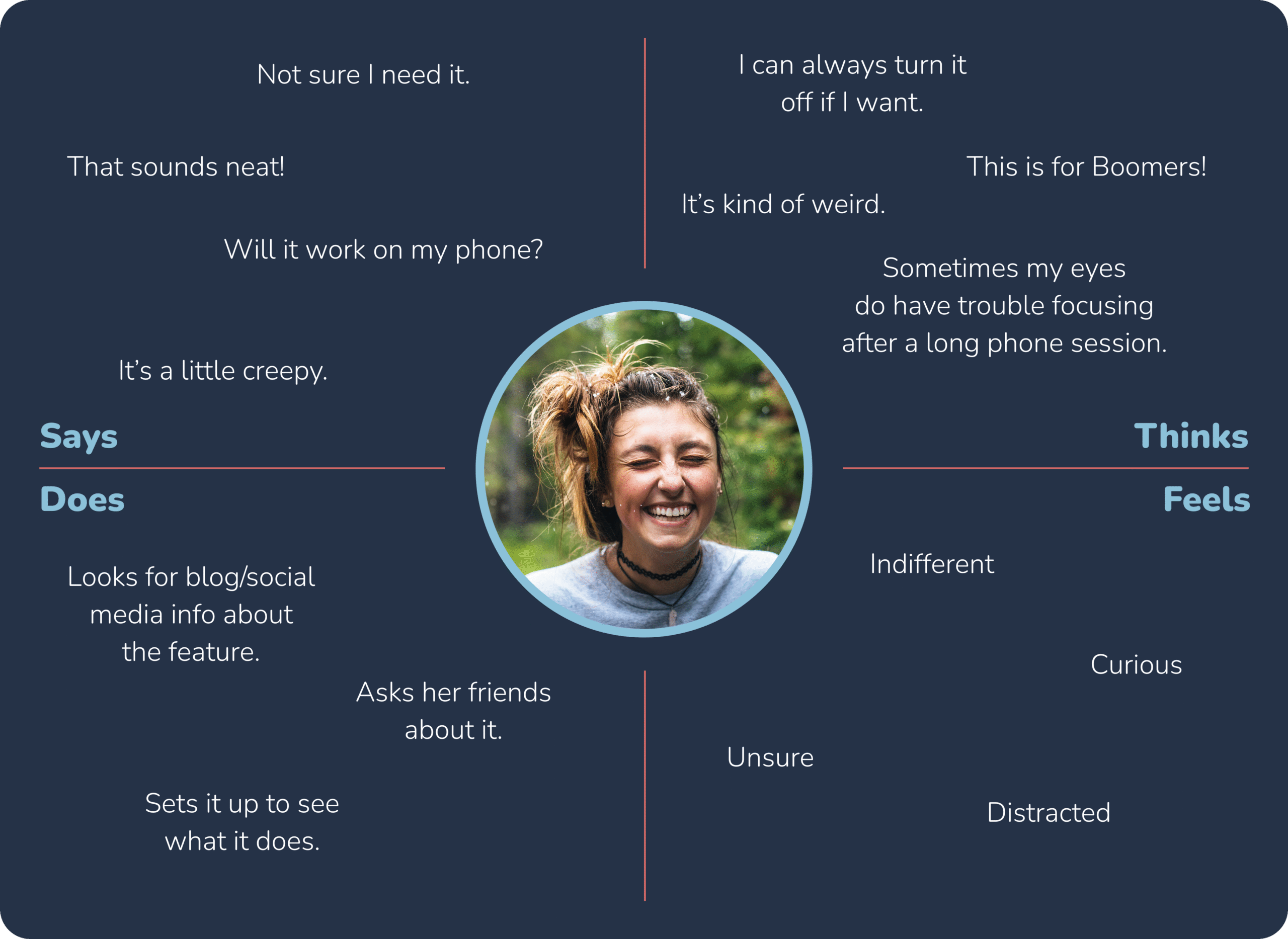
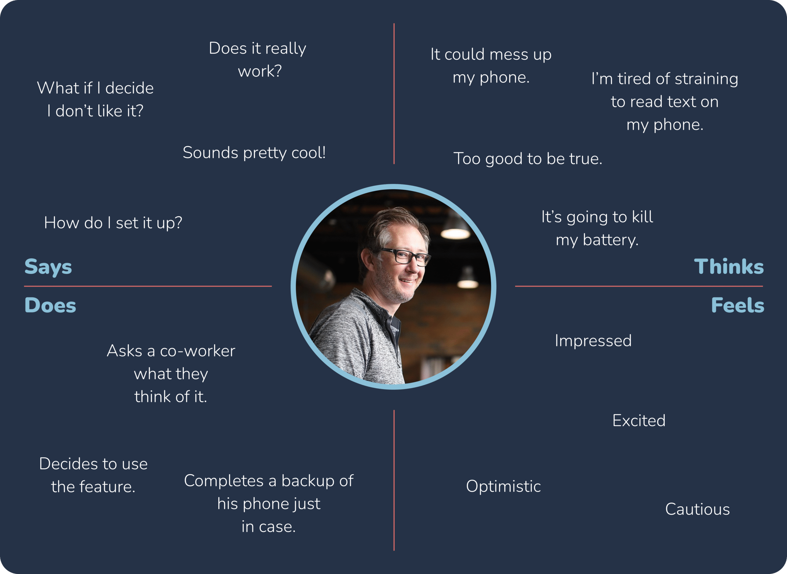
Because this is a feature that potentially affects so many users, I felt the need to create a few user personas to guide my process. Using my research as a guide, I created three representative personas with corresponding empathy maps. These personas were a useful lens through which I could view the project and anticipate any pain points or road blocks.
I do not claim to be an iOS engineer but based on my research as well as lengthy conversations with ChatGPT on the subject, the functionality I am proposing is possible with the current/near-future technology in use on Apple’s recent iPhones. I cannot state precisely which model of iPhone would be the baseline for which these features would be possible, but any phones with the following technologies would be in the running:
- Facial Expression Detection via Vision Framework (ARKit/Vision)
- Eye Tracking and Gaze Estimation via ARKit and TrueDepth Camera
- Adaptive UI Adjustments via UIKit + Accessibility APIs
- Machine Learning for Personalization via Core ML
- As always, the newer the phone, the better this feature will work.
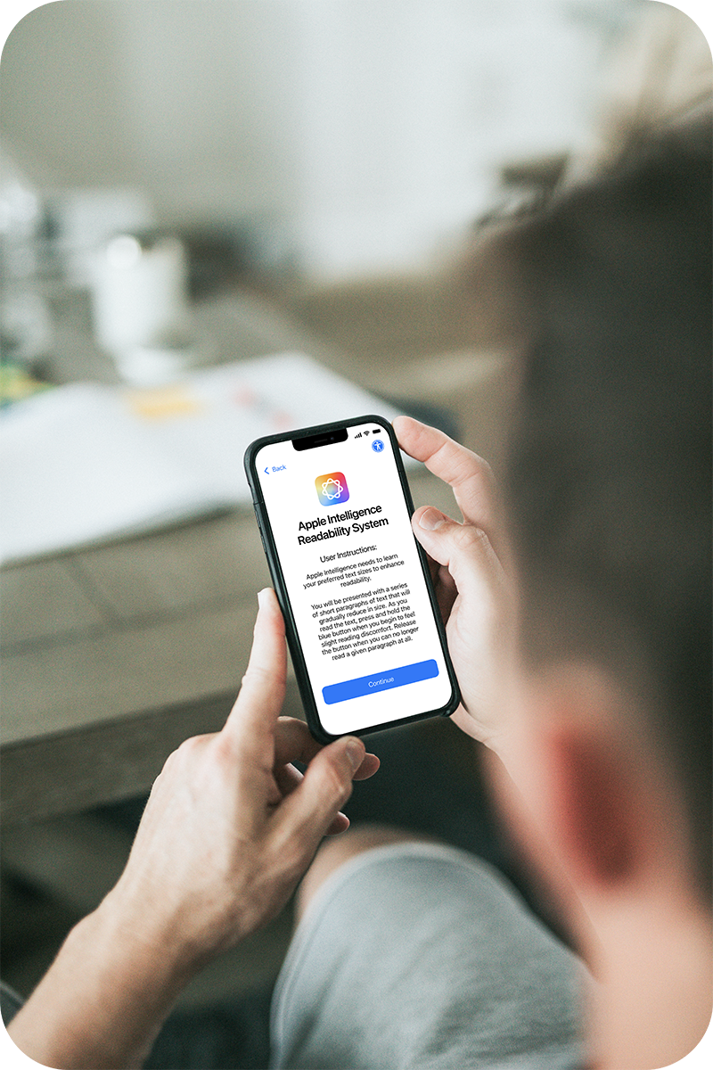
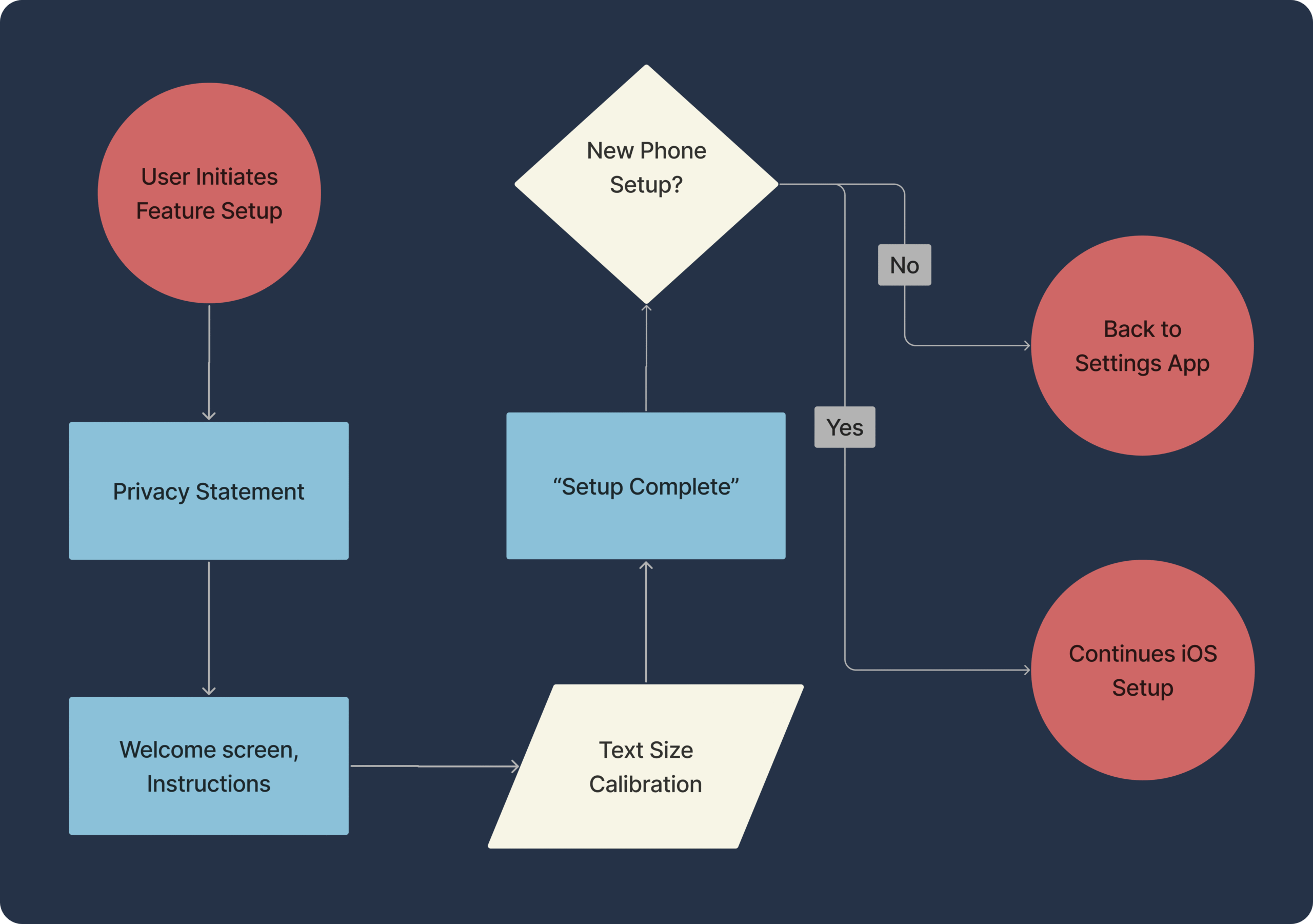
Embedded within the standard iOS setup flow would be an additional process for the configuration of this feature. The user could also complete the setup later in the Settings app if they initially opt-out of using it. Let’s look in detail at an example of how this might play out.
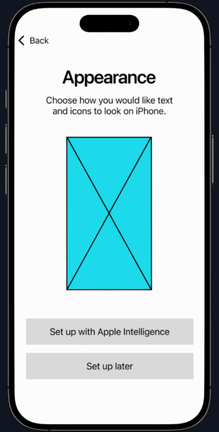
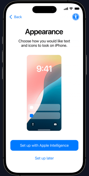
- Apple currently has a basic text/icon size slider screen early in the setup process, right after the “hello” screen. I propose to add an additional screen before that one with a choice to set up the AI-readability feature. They can “set up later” if they wish and opt for the basic slider instead.
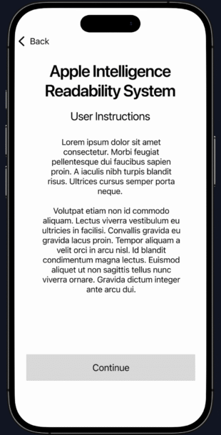
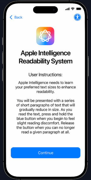
- If they choose to continue, there will be a standard privacy statement screen, then a screen with instructions on what the setup process looks like and how to complete it.
- The process should be ideally completed without reading glasses, but there is no reason why the system couldn’t be configured to have a different set of text settings if glasses are detected on the user. This would be accomplished via a separate setup process. So that the instant the user puts on their reading glasses, an alternate set of text sizes is populated.
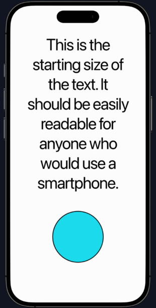
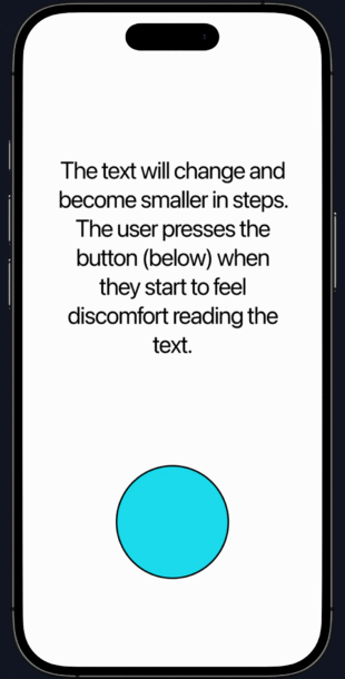
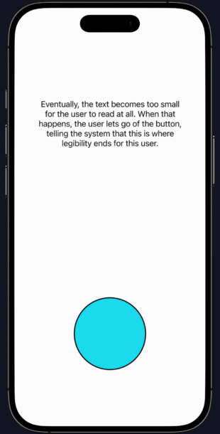
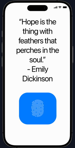
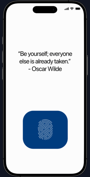
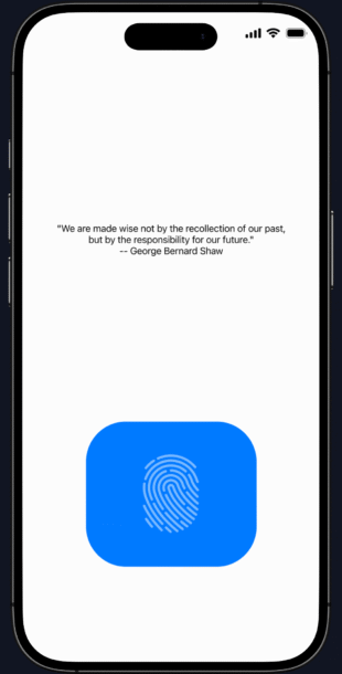
- Once they press “continue” they will be presented with a sentence of dummy text. This text will change as it gradually gets smaller in steps at a measured pace. The user is to press a button when they first sense reading discomfort and hold the button until the text is no longer readable.
- This will give the system a few very useful data points:
- What text is easily readable by the user
- The size at which difficulty reading the text begins
- The absolute smallest text the user can read unassisted
- It will also record the user’s facial expressions to use as a data point in later predicting if the user is having difficulty reading in real time.
- This will give the system a few very useful data points:
- A menu option will be added to the Accessibility section in iOS Settings that contains various options. There will also be a radio button in each per-app settings so that users can turn the system off for any app they choose.
- Also, there is no reason why these settings could not follow the user across any other eligible Apple devices they use, providing consistent readability no matter the device.
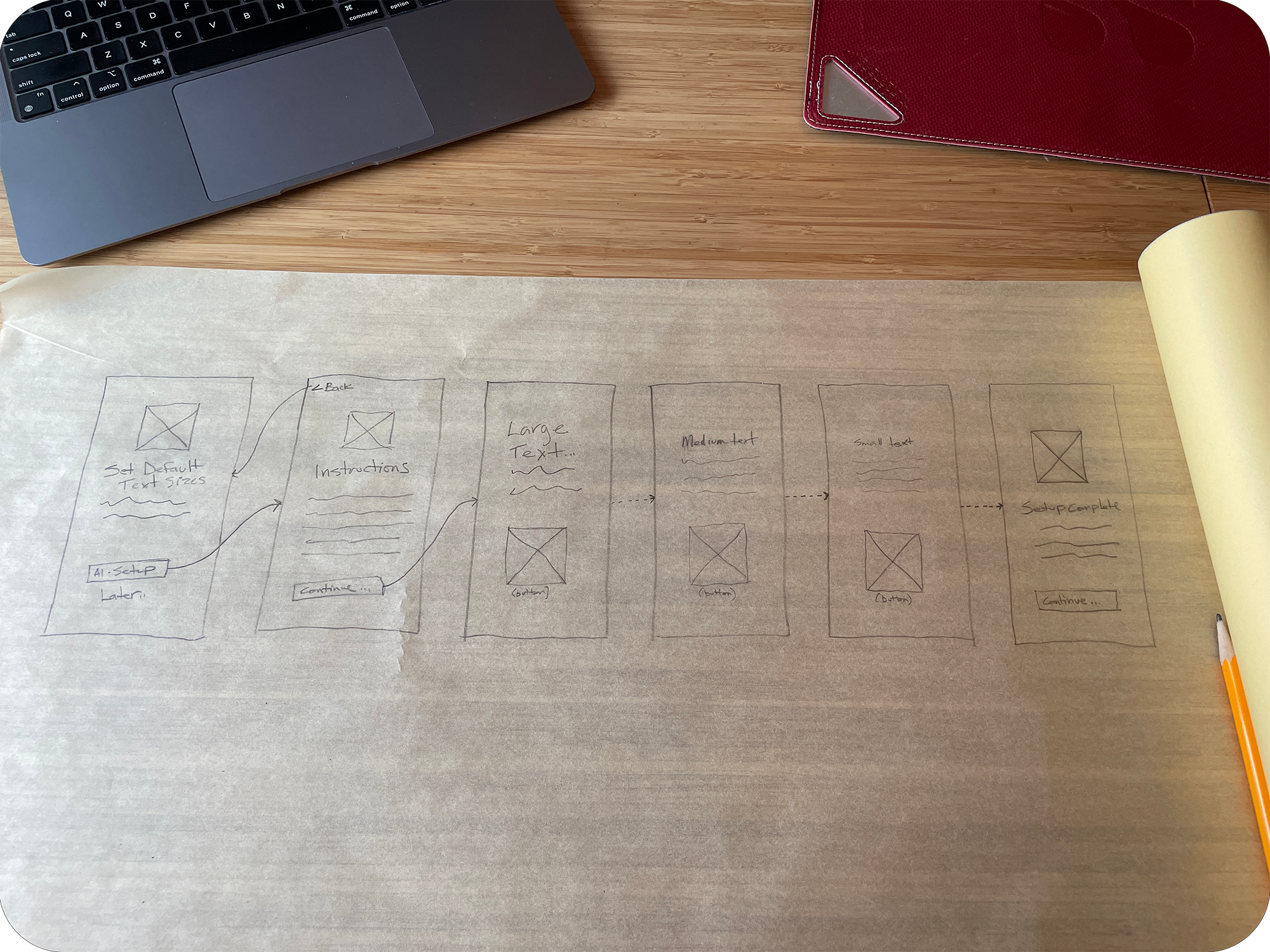
Once I had the user flows nailed down, I started producing some rough wireframes on tracing paper. I based these sketches on the data I collected from my research and interviews, as well as my study of the proper implementation of Apple’s Style Guide when designing for iOS. Using paper, I was able to move fast and get some important decision-making out of the way.
- I was able to eliminate a redundant text-size confirmation screen that would have only confused users.
- The size and position of the button used to calibrate the system was studied extensively on paper and then again later as I created the low-and-high-fidelity wireframes.
Taking what I learned from my sketches and user flows, I used Figma to create a set of low-fidelity wireframes in order to begin testing with users. I expect this stage to get me very close to the final design since the feature I am designing is a system feature and the low-fidelity wireframes are close to what the final design will look like.
I tested these wireframes with 5 users and made a few minor alterations based on their feedback:
- They had problems with the button on the calibration screen:
- It wasn’t big enough.
- It needed to change color when pressed.
- It needed some indication that it was a button.
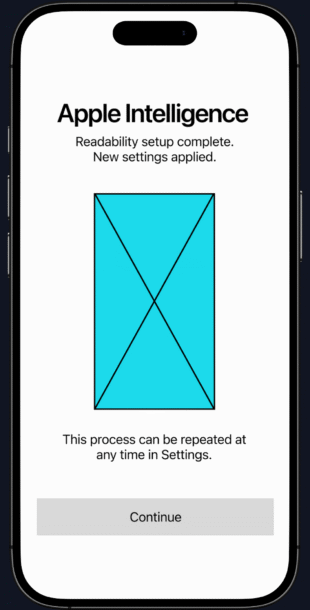
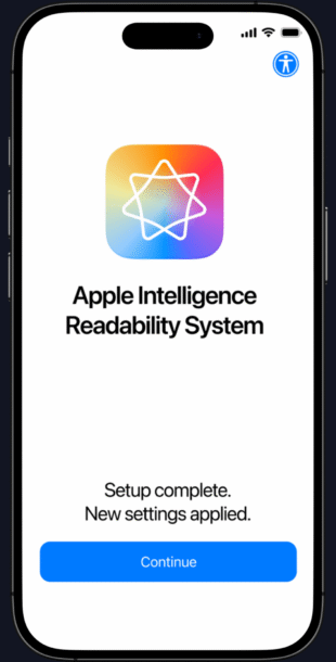
- They wanted a formal confirmation screen to let them know the process is complete.
After making changes to the design based on the previous test results, I started on the final UI design in Figma. It was very important to me to not only fully represent the feature I am proposing, but also to make it feel like it belongs in the iOS ecosystem. I referred frequently to Apple’s iOS style guide as well as performing a detailed, screen-by-screen analysis of Apple’s iOS setup process to aid in this process.
As for the text that the user reads, I chose a few famous quotes as examples, but lots of other options exist.
The end result I feel does capture the essence of Apple’s philosophy of simplicity and elegance, even if they have never really done anything like I am proposing in this case study.
I wanted to create a prototype to give a general sense of what it would be like to go through the setup process as I feel that would be most informative.
Because of the complex interactivity of the system, I was not able to fully represent every interaction using Figma. Specifically, Figma appears to have no way to allow interaction/animation for a held button, which is important for my prototype. Nevertheless, I feel it gives a pretty good impression of the user’s experience.
This was a fascinating project that started out as a simple idea but became very demanding in terms of conceptual problem-solving and technical analysis. I’ve designed a complete system here as one possible solution, but really this is just a starting point for future designers and developers to consider as technology progresses. I don’t foresee people leaving screens behind anytime soon, so there will definitely be improvements to user-text interaction in the future, even if they don’t follow the path I’ve laid here.